
UI/UX Design Trends for 2026 Every Designer Needs to Know
Design is evolving fast — especially with AI reshaping user interfaces. Here's what's in, what's out, and what's genuinely transforming the craft of designing digital experiences in 2026.
Design in the Age of AI
No creative discipline is being reshaped by artificial intelligence more visibly than design. AI tools now generate layout suggestions, produce brand assets, write microcopy, and — in the most advanced implementations — adapt interfaces in real time based on individual user behaviour. The question for designers in 2026 is not whether AI will affect their work (it already has, profoundly) but how to engage with it in ways that enhance rather than replace the human judgment that distinguishes great design from adequate design.
Against this backdrop, 2026's design trends reflect a complex negotiation between technological capability and human need. The most interesting trends are not primarily about aesthetics — they are about how digital products accommodate human cognition, accessibility requirements, and the irreducible need for interfaces that feel genuinely considered rather than algorithmically generated.
Trend 1: Bento Grid Layouts — Organisation as Aesthetic
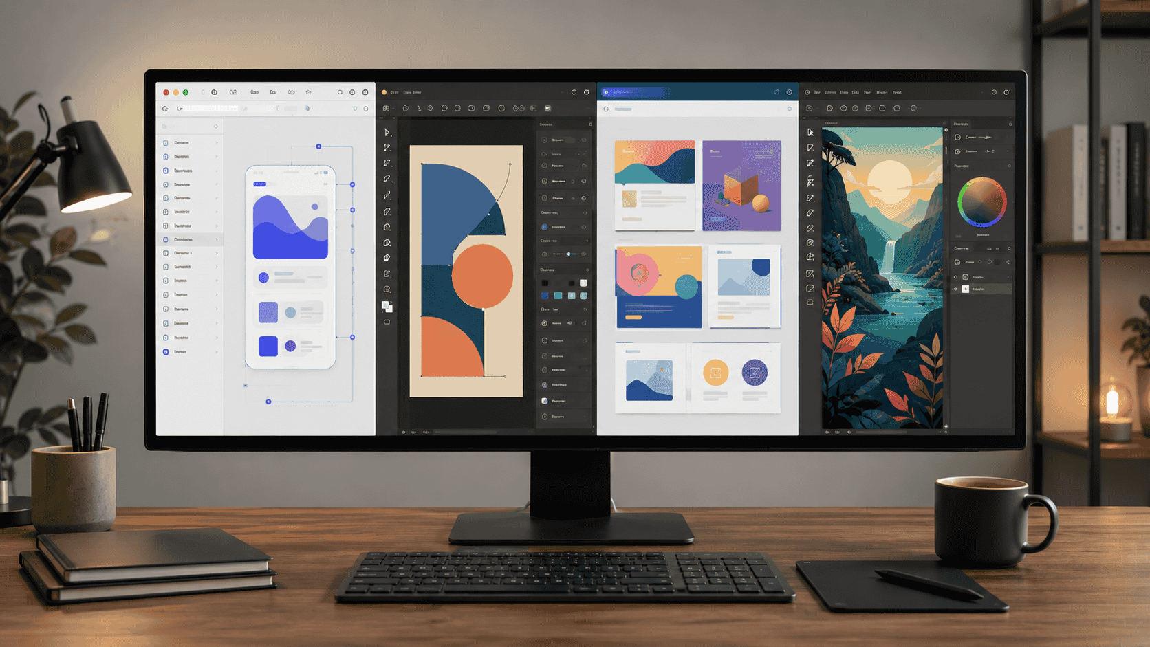
The bento grid — a modular layout system inspired by the Japanese lunch box, in which differently sized rectangular cards are arranged in a cohesive grid — has become one of the most distinctive and most widely adopted interface patterns of 2025–2026. Apple popularised it in their marketing materials; product teams across the industry have adopted it for dashboards, portfolios, feature showcases, and landing pages.
The bento grid works because it solves a genuine design problem: how to display disparate information types — large hero elements, small statistics, medium-sized feature cards — in a way that feels organised without being monotonous. The asymmetric-but-structured quality of a well-executed bento layout creates visual interest while communicating hierarchy clearly.
Where it works best: SaaS product marketing pages, portfolio sites, dashboard interfaces, app feature showcases
Common mistakes: Overcrowding cards to fill grid space; inconsistent padding inside cards; bento grids that collapse poorly on mobile
Tools for implementation: CSS Grid is the native web implementation; Figma's Auto Layout handles bento prototyping well
Trend 2: AI-Native Interface Patterns
As AI features become standard in software products — writing assistants, image generation, predictive text, intelligent search — a new vocabulary of interface patterns has emerged for representing and interacting with AI capabilities. These patterns are still being standardised, and the designers who establish them early will shape the conventions that become default across the industry.
The Key Emerging Patterns
Progressive disclosure for AI output: Streaming text generation (showing the AI's response as it's written rather than waiting for completion) has become the dominant pattern for conversational AI — but its application to other AI-generated content (images, code, summaries) is still being worked out
Confidence indicators: Interfaces that communicate how certain the AI is about its output — reducing over-reliance on AI responses in high-stakes contexts
Human-in-the-loop checkpoints: Design patterns that require explicit human review and approval before AI actions affect real-world outcomes — particularly in agentic AI tools that take actions autonomously
AI suggestion vs AI execution: The distinction between interfaces that suggest AI-generated options (which the user selects) and interfaces where AI acts directly — with different trust and transparency requirements for each
Why this matters: Every designer working on software products in 2026 is working on products that include AI features. Understanding how to design these features well — clearly communicating AI's role, building appropriate trust, and maintaining user control — is now a core UX competency.
Trend 3: Accessibility as Design Quality Indicator
Accessibility in digital design has been a legal requirement (WCAG compliance is mandated for many organisations under the ADA in the US and EN 301 549 in the EU) and a moral imperative for years. In 2026, it is increasingly also a competitive differentiator — with sophisticated design teams treating accessibility excellence as a marker of overall design quality rather than a compliance checkbox.
Several forces are driving this shift. The EU's European Accessibility Act, which came into full effect in June 2025, significantly expanded mandatory accessibility requirements for digital products and services. Growing awareness of the scale of the accessible market (over 1 billion people globally have some form of disability). And the influence of design leaders at organisations like Apple, who have consistently demonstrated that accessible design produces better products for all users, not just users with disabilities.
What Accessibility Excellence Looks Like in 2026
Colour contrast: WCAG AA compliance (4.5:1 ratio for body text) as the minimum; WCAG AAA (7:1) as the aspiration for primary content
Focus indicators: Highly visible keyboard focus states that don't sacrifice aesthetics — one of the most neglected accessibility requirements in otherwise polished designs
Motion and animation: Respecting prefers-reduced-motion media queries for users with vestibular disorders who experience nausea from screen animation
Plain language: Writing copy that meets WCAG's readability guidance — shorter sentences, simpler vocabulary, clear hierarchy
Touch target sizing: Apple's HIG and Google's Material Design both specify 44pt / 48dp minimum touch targets — widely ignored in practice, increasingly enforced in design reviews
Trend 4: Variable Fonts and Kinetic Typography
Variable fonts — single font files that contain a range of weights, widths, and optical sizes accessible through CSS — have been technically available since 2016 but have reached mainstream adoption in 2025–2026. The performance benefit (one file instead of 6–8 separate weight files) is significant. The creative opportunity — smooth interpolation between weights and styles, responsive typography that changes weight with screen width, animation through the variable axes — is even more significant.
Kinetic typography — text that moves, changes weight, or transforms as part of the interface — has emerged from experimental design into product design as variable font support and GPU-accelerated CSS animation have made it performant enough for production use. The most sophisticated examples animate between font weights on hover, scale text smoothly with container resize, and use text motion to communicate state changes rather than relying solely on colour or icons.
Tools leading this trend: Google Fonts variable font collection (free), Fontshare's variable library, and the font-variation-settings CSS property for fine control
Accessibility consideration: Motion and animation from typography changes must be managed with the same prefers-reduced-motion care as any other interface animation
Trend 5: Spatial Design for Mixed Reality
The launch of Apple Vision Pro in 2024 and the subsequent iterative development of spatial computing platforms has created a new design discipline that is still in its formative stages. Spatial UI/UX design — designing interfaces for three-dimensional environments where users interact through gaze, gesture, and voice rather than touch or cursor — requires rethinking virtually every convention of flat screen design.
Depth, scale, lighting, and the relationship between digital content and physical space are all design variables in spatial interfaces that don't exist in 2D design. The handful of designers who have developed genuine expertise in visionOS and equivalent spatial platforms are among the most sought-after in the industry — the skills are scarce relative to the demand.
For the majority of designers, spatial design is currently relevant as an area to understand and begin exploring rather than a core production skill. The volume of spatial design work remains small relative to web and mobile — but it is growing, and the patterns being established now will shape the conventions of the next computing paradigm.
Trend 6: Anti-Dark Pattern Design — Ethical UX
Dark patterns — deceptive UI designs that manipulate users into actions they didn't intend (subscribing, sharing data, making purchases, declining privacy protections) — have come under significant regulatory scrutiny in 2025–2026. The EU's Digital Services Act and Digital Markets Act both include provisions targeting deceptive design practices. The FTC in the US has pursued enforcement actions against companies using dark patterns in subscription cancellation and data collection flows.
Progressive design teams are positioning ethical, transparent design as a brand differentiator — demonstrating that user-respecting design produces better long-term retention and trust than manipulative patterns produce short-term conversion. The most sophisticated manifestation is "honest design" or "ethical UX" as an explicit design philosophy rather than a regulatory compliance posture.
What ethical UX looks like in practice: Unsubscribe flows as simple as subscribe flows; cookie consent that makes rejection as easy as acceptance; pricing presented with full costs rather than hiding mandatory fees; cancellation without dark confirmation dialogs ("Are you sure you want to lose all your data forever?")
Trend 7: Skeuomorphism's Return — But Smarter
The flat design revolution that dominated the 2010s is giving way to a more nuanced approach in 2026 — not a full return to the heavy skeuomorphism of iOS 6-era design, but a thoughtful incorporation of depth, texture, and physicality-inspired cues that improve usability and emotional resonance without sacrificing clarity.
Neumorphism's brief 2020 moment demonstrated the risk of over-correction — the style was beautiful in mockups and largely unusable in practice due to poor contrast. The 2026 approach is more calibrated: subtle shadows that indicate elevation and interactivity, textured backgrounds that give digital content spatial weight, and button states that incorporate pressure and depression cues familiar from physical interaction.
Apple's visionOS, with its translucent materials and physically plausible lighting, is the most influential example of this return — demonstrating that physicality cues enhance rather than clutter interfaces when applied with restraint.
What's Fading Out in 2026
Aggressive gradients: The vivid purple-to-pink gradient that dominated 2022–2024 branding has peaked and is now a date-stamp rather than a design choice
Hamburger menus on desktop: The increasing evidence that three-line menu icons perform poorly for discoverability has accelerated the shift to visible navigation on desktop
Infinite scroll without intention: Regulatory and ethical pressure, combined with user fatigue, is pushing product teams toward paginated or clearly-bounded content flows rather than the manipulative infinite scroll optimised for engagement metrics
Modal overuse: The over-reliance on modals for every interruption, confirmation, and information display is being replaced by in-context patterns that don't interrupt the user's primary flow
UI UX design trends 2026, web design trends 2026, bento grid design, AI interface design patterns, accessibility web design, variable fonts 2026, ethical UX design, spatial design visionOS, skeuomorphism return, design trends 2026


Discussion
Comments
Approved comments are published after moderation to keep discussion useful and spam-free.
No comments yet. Start the discussion below.